I’m a big fan of Bret Victor, and have recently decided to read everything on his website again. Here are my notes to his article “How Many Households.” You can read the original here.
Key Takeaways
- Show the data, compare the data, let the data guide reader interactions
- The essence of data graphics is visual comparisons, even for static ones. Even if completely static, make sure the graphic informs. Add interactivity –judiciously, powerfully, consistently –to subset data space according to readers’ interests
- Don’t make interactivity a barrier to information
Full Notes
- The essence of data graphics is visual comparisons
- Data can’t be compared when there are millions of data points, but only one is displayed at any given time
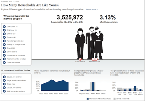
- Many charts (like the one immediately above) require users to interact with a chart to switch between data points, often times through a convoluted navigation scheme with no clear information hierarchy, peek-a-boo menus that appear and disappear, and “actions at a distance” where clicking a menu causes a far-away image to change, and clicking the image causes the menu to change
- This type of confused navigation scheme is not even the main problem!
- The main problem is that any type of navigation is even needed. Chart readers have to continually interact with these charts, and have to beg for every scrap of info
- The essence of data graphics is visual comparisons
- An excellent graphic offers its info generously and eagerly, helping and encouraging its reader to answer wide-ranging comparative questions at a glance
- An excellent interactive graphic offers many opportunities to explore the data space more precisely, to slice and filter the data, to see the data from different specific perspectives
- Interactivity should NOT be a barrier to information
- Keep information design and interactive design simple and consistent
- Graphics should provide information right off the bat, and that information should inform the readers’ interactions
- Every interactive element should be informational (ie bar graphs that display data AND provide a means to filter data; graphs that show distribution and slice the data in specific ways ie constrain a graphic to a specific variable)
- There should be no UI buttons/control to clutter the graphic
- Each feature should be offered simply by making the graphs consistent with the other graphs (ie click to filter)
- Each click should potentially reveal a large amount of new data; this makes each interaction powerful, meaningful, and worthwhile. No gratuitous actions; every click rewarded

- Some charts use unusual forms of multiple selection (ie when a category choice also needs a quantity specified, like the one immediately above)
- Solution: being informational and consistent
- For the second chart (“And who lives with them?”), say we want to see the data for “any children,” but also want to see the data for “1 child,” “2 children,” etc. Show all of the quantities as bar graphs, with the distribution of children expanding out when the “any children” bar is clicked
- Interaction-wise, this graphic simply assumes the reader wants to specify one child, and immediately selects it, with the other selections just a click away
- Keep designs stable. If something appears after a click, keep it there. Don’t move anything around, don’t make anything disappear.
- This lets the reader take in and grasp the layout of the information space, and quickly explore new ideas without “navigation” getting in the way.
- “Progressive disclosure,” where charts are introduced one by one, is to prevent the reader from being immediately overwhelmed by the graphic and skipping it (best used for general audiences, not necessary for sophisticated/motivated readers)
- Another powerful technique is filtering on rollover instead of click
- This allows reader to skim the mouse over a graph and immediately see the data sliced in every way –a huge information payoff for little interaction (can be awkward to integrate with charts like multiple-selection charts, but in general a solid technique)
